In this post I will walk you through the basics of working with network objects in R. First we’ll create a simple network from scratch, manipulate it using tidygraph’s very clean framework, and then do some simple plotting using ggraph and networkD3. After that we will step it up a bit with a larger dataset to calculate some network metrics.
My goal for this post is to show how the basic manipulation steps from the simple example can also be used on much more complicated data to easily allow us to carry out many complex calculations with very little code. I would like to note that all of this is possible because of the huge effort software developers have put into projects like igraph, tidygraph, ggraph, and networkD3.
Libraries needed:
library(tidygraph) # Network manipulation
library(magrittr)  # Data wrangling
library(tidyverse) # Data wrangling
library(ggraph)    # Static network plotting
library(patchwork) # Arrainging plots
library(networkD3) # Interactive network plotting
Lets make a simple graph!
Making networks is much easier than it sounds. We can build one by creating two vectors of equal length and then binding them into a dataframe.
from  <- c(1, 1, 2, 3, 4, 5)

to    <- c(2, 3, 4, 4 ,5, 6)

# combine the from and to vectors into a simple dataframe
basic <- tibble(from, to)
What we just made is called an “edge list” which is essentially a dataframe that says “there is a connection from node 1 to node 2, another from node 1 to node 3.” And on and on… This is the minimal unit for a network. We have our nodes (all the unique elements in our network 1, 2, 3, 4, 5, and 6) and the information of how they are connected (the order in which they appear in the data).
Nodes typically represent the “actors” of our network. They could be governmental entities, animals, corporations, anything really. If you squint hard enough there are networks to be found all around.
## # A tibble: 6 x 2
##    from    to
##   <dbl> <dbl>
## 1     1     2
## 2     1     3
## 3     2     4
## 4     3     4
## 5     4     5
## 6     5     6
Now lets use networkD3’s simpleNetwork() function to quickly make an interactive plot so we can visualize our simple network. The nice thing about this function is that it only requires an edge list. There is no data wrangling needed. Go on, click and drag a node!
networkD3::simpleNetwork(basic)This is an awesome function, but the customization is a bit limited. We will use another function from this package to increase the amount of customization for our visualization later on in the post.
Converting the edge list to a tidygraph object.
In order to convert the edge list into a tidygraph object, we use tidygraph::as_tbl_graph().
tidy_basic <- basic %>%
  as_tbl_graph()
What is a tidygraph object?
The tidygraph object consists of two dataframes connected: The nodes dataframe (each point) and the edge dataframe (each connection). This structure is very human readable and allows for easy inspection of our object. Look below at what is returned when we call the tidygraph object.
## # A tbl_graph: 6 nodes and 6 edges
## #
## # A directed acyclic simple graph with 1 component
## #
## # Node Data: 6 x 1 (active)
##   name
##   <chr>
## 1 1
## 2 2
## 3 3
## 4 4
## 5 5
## 6 6
## #
## # Edge Data: 6 x 2
##    from    to
##   <int> <int>
## 1     1     2
## 2     1     3
## 3     2     4
## # … with 3 more rows
Tidygraph allows us to use the easily readable code that we are used to from the tidyverse to manipulate igraph objects.
Working with tidygraph
In order to manipulate the tbl_graph we need to tell R which of the two data frames we want to operate on. This is done with activate(nodes) or activate(edges). I will show how we can name each node and give each edge a random amount of transparency. Note the activate call between the operations.
tidy_basic_manipulated <- tidy_basic %>%
  activate(nodes) %>%              # tell tidygraph we want to work on the modes dataframe
  mutate(id = letters[1:6]) %>%    # adding an id column for each node a - f
  activate(edges) %>%              # tell tidygraph we want to work on the edge dataframe
  mutate(alpha = runif(6, min = 0, max = 1)) # give each edge a random transparency value
Now let’s take a quick look at the columns we added to the plot. We can see the new alpha column added to the edges and the id column added to the nodes.
## # A tbl_graph: 6 nodes and 6 edges
## #
## # A directed acyclic simple graph with 1 component
## #
## # Edge Data: 6 x 3 (active)
##    from    to alpha
##   <int> <int> <dbl>
## 1     1     2 0.749
## 2     1     3 0.530
## 3     2     4 0.939
## 4     3     4 0.452
## 5     4     5 0.177
## 6     5     6 0.337
## #
## # Node Data: 6 x 2
##   name  id
##   <chr> <chr>
## 1 1     a
## 2 2     b
## 3 3     c
## # … with 3 more rows
Some quick plotting using ggraph.
We will delve into this a bit more later, so for now lets just make a basic plot. In order to use ggraph we need to specify the layout, (I will explain this later) and we need to give both the nodes and edges a geom_.
ggraph(tidy_basic_manipulated, layout = 'sugiyama')+
geom_edge_link (aes(alpha = alpha)) + # plot the links between nodes
geom_node_point (aes(color = id)) + # add color to the nodes
geom_node_text (aes(label = id), repel = TRUE) # add the names of each node as a label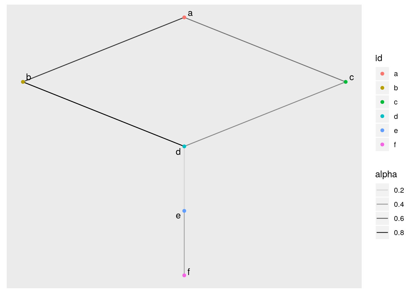 Super! We created a simple edge list, made it into a tidy graph object, manipulated it, then plotted it. Next we will step up the complexity with a bigger dataframe and use some network analysis calculations. I hope I can prove to you that this is about as simple as what we just did.
A slightly more complex example
Let’s look at the highschool dataset from ggraph. This dataset was made by asking a class of students at an all boys highschool to list their friends in 1957 and then again in 1958. To keep things simple, I am going to just use the first year of data. So let’s filter for the first year of data and turn it into a tidygraph.
hs_tidy <- highschool %>%
  filter(year == 1957) %>% # remove the time component for this example
  select(-year) %>% # remove the year column we wont be needing it
  as_tbl_graph() # turn the edge list into a tbl_graph
And let’s plot it real quick so we know what we are dealing with.
ggraph(hs_tidy, layout = "stress") +
  geom_node_point() +
  geom_edge_link()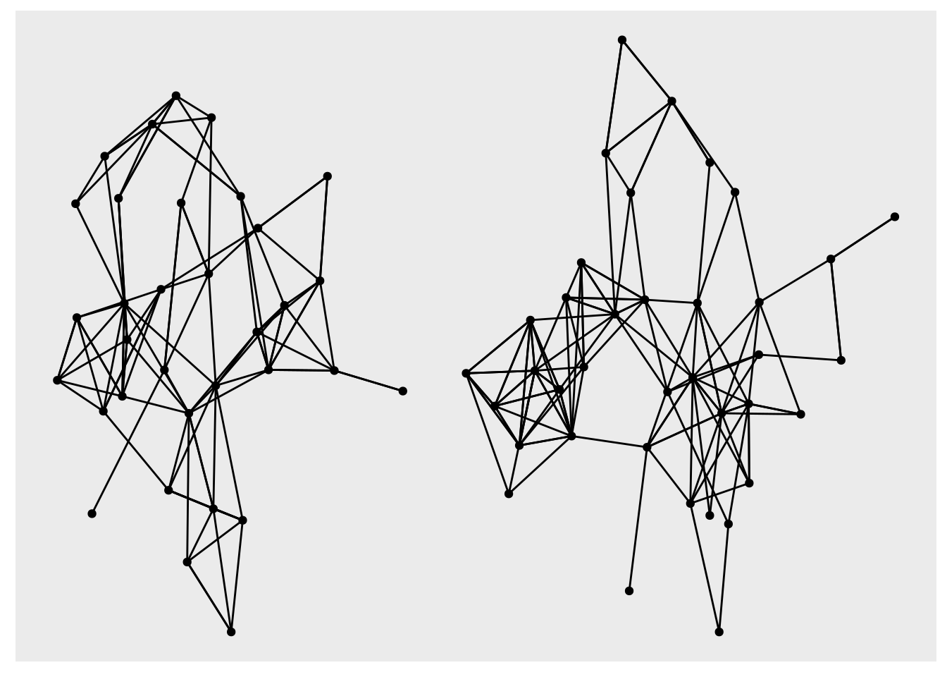
Now that we have our data into tidygraph’s tbl_graph object we can easily calculate many statistical measures for each node or edge by easily combining activate() and mutate(). There are quite a few centrality measures from igraph and all are fully supported with tidygraph. A full list can be found HERE.
hs_manipulated <- hs_tidy %>%
  activate(nodes) %>%
  mutate(
    # calculate various centrality measures
    central_alpha  = centrality_alpha(),
    central_degree = centrality_degree(),

    # calculate various grouping/clustering measures
    components     = as.factor(group_components()),
    walktrap       = as.factor(group_walktrap())

  ) %>%
  activate(edges) %>%
  mutate(
    # calculate edge centrality
    weight =  centrality_edge_betweenness()
  )
Just like that, we calculated two types of node centrality, ran two grouping algorithms, and calculated edge betweenness! Let’s take a look at our new metrics.
## # A tbl_graph: 70 nodes and 243 edges
## #
## # A directed simple graph with 2 components
## #
## # Node Data: 70 x 5 (active)
##   name  central_alpha central_degree components walktrap
##   <chr>         <dbl>          <dbl> <fct>      <fct>
## 1 1             1.                 5 1          1
## 2 2             1                  2 1          1
## 3 3             1                  2 1          1
## 4 4            -1.33               4 2          2
## 5 5            -0.333              2 2          2
## 6 6            -7.5                3 1          1
## # … with 64 more rows
## #
## # Edge Data: 243 x 3
##    from    to weight
##   <int> <int>  <dbl>
## 1     1    13   1.83
## 2     1    14   8.33
## 3     1    20   2.98
## # … with 240 more rows
Let’s plot it and specify aesthetics based off the metrics we calculated.
ggraph(hs_manipulated, layout = 'stress') +
  geom_edge_link (aes(alpha = weight)) +
  geom_node_point(aes(color = walktrap,
size = central_alpha)) 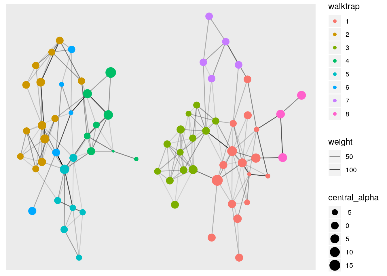
Now lets play around a bit with some of the functionality of ggraph. This package is made to behave a lot like ggplot2. However, one key difference is the layout argument. This tells ggraph which algorithm to use when laying out the nodes. You can go really deep down this rabbit hole if you like. If you want to, you can start creating your own layouts with the particles package.
Or, you can just do what I do and choose random ones until you get one you like.
a <- ggraph(hs_manipulated, layout = "kk") +
  geom_node_point(aes(color = components)) +
  labs(title = "Layout stays the same",
       subtitle = "Nodes don't move")

b <- ggraph(hs_manipulated, layout = "kk") +
  geom_edge_link() +
  geom_node_point(aes(color = components))


c <- ggraph(hs_manipulated, layout = "kk") +
  geom_edge_hive() +
  geom_node_point(aes(color = components))


d <- ggraph(hs_manipulated, layout = "linear") +
  geom_edge_arc() +
  geom_node_point(aes(color = components)) +
  labs(title = "Change in layout",
       subtitle = "Move the nodes")

e <- ggraph(hs_manipulated, layout = "linear", circular = TRUE) +
  geom_edge_arc() +
  geom_node_point(aes(color = components))


f <- ggraph(hs_manipulated, layout = "mds") +
  geom_edge_link() +
  geom_node_point(aes(color = components))


# laying out the plots with patchwork
plots_compared <- ((a/b/c) | (d/e/f)) +
  plot_layout(guides = 'collect')  +
  plot_annotation(tag_levels = 'a')

plots_compared 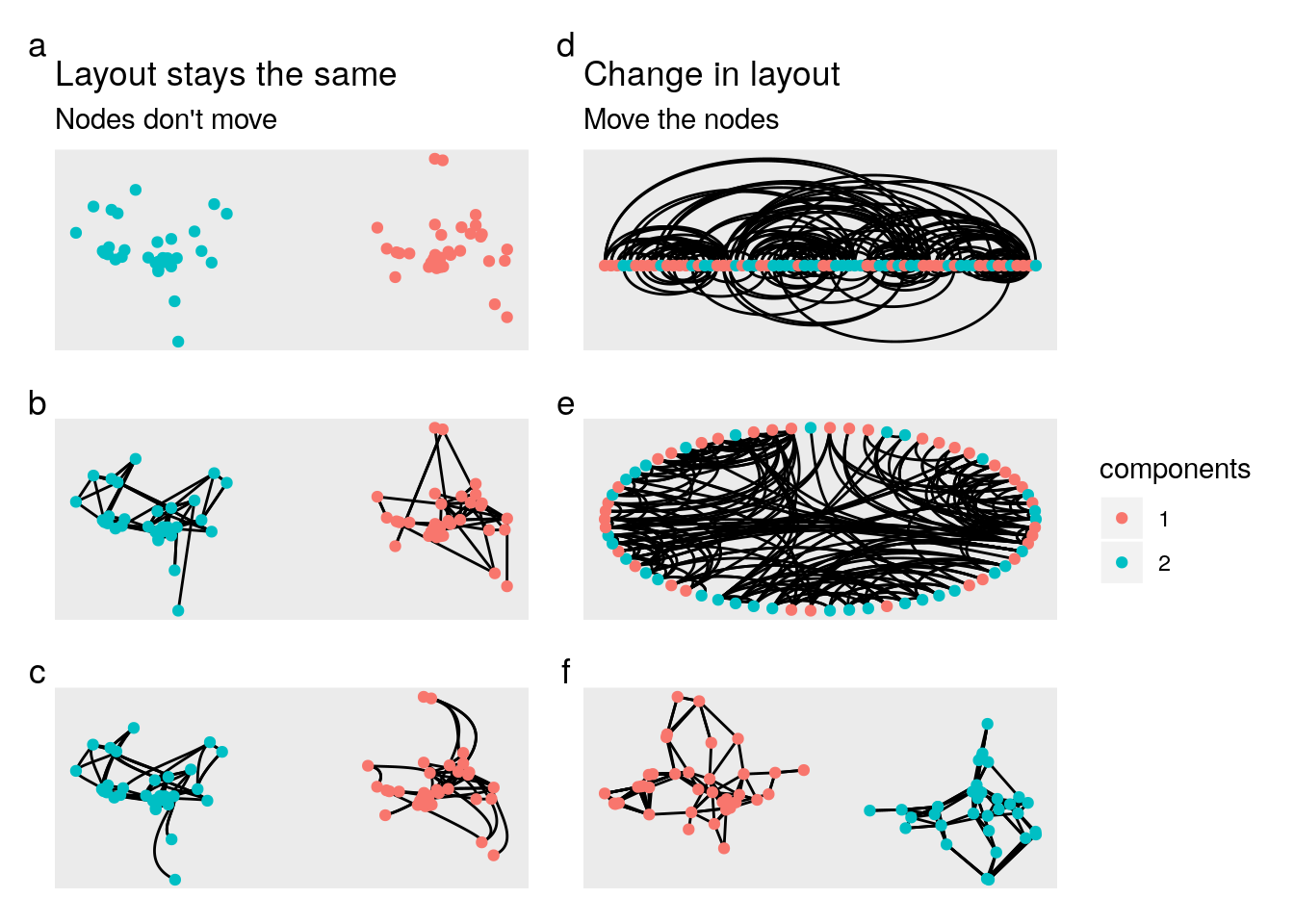
Now that you have mastered static plotting, let’s take another look at the interactive plotting we can do with networkD3.
Use networkD3 to make a more detailed plot
Unfortunately, networkD3 does not play nicely with tidygraph so we’ll need to do some finagling. First we need to convert our tidygraph object to a network d3 object using igraph_to_networkD3(). In order to specify the group each nodes belongs in, we need to extract a named vector to specify the group argument. Then we need to create our JavaScript color scale.
# 1. Make the named vector that specifies which group each node belongs to

## extract our nodes from tidygraph as a data frame
group_information <- hs_manipulated %>%
  activate(nodes) %>%
  as_tibble()

## create a named vector with node names and the group they belong to
node_vec <- as.numeric(group_information[["name"]])
group_vec <- as.numeric(group_information[["components"]])

group_info <- set_names(x = group_vec, nm = node_vec)

# 2. Convert igraph to list for networkD3
d3_object <- igraph_to_networkD3(hs_manipulated, group = group_info)


# 3. Set the colors for d3 orange and blue for now
ColourScale <- 'd3.scaleOrdinal()
            .domain(["1", "2"])
           .range(["#FF6900", "#89cff0"]);'


# 4. Plot as a forceDirected Network
forceNetwork(Links = d3_object$links,
             Nodes = d3_object$nodes,
             Source = 'source',
             Target = 'target',
             NodeID = 'name',
             Group = 'group',
             colourScale = JS(ColourScale),
zoom = TRUE)We will leave it there for now, but if you are looking for more I recommend this awesome post from the creator of tidygraph. And for a really cool applied example, check out this analysis.
